Mobile-First Debugging: Fix HTML Layout Issues with HTML Viewer
The digital landscape has shifted dramatically over the last decade. Today, more than half of all web traffic comes from mobile devices. If your website looks perfect on a desktop but falls apart on a smartphone, you are likely losing half of your potential audience. Is your website truly ready for mobile users?
Mobile-first design is no longer just a trend; it is a necessity for SEO and user experience. When a layout breaks, finding the exact line of code causing the mess can be frustrating. Whether it is a tiny button or an image stretching off the screen, these errors drive users away. Fortunately, using a professional html viewer helps you identify and fix these issues in minutes.
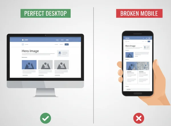
Let’s unravel why mobile layouts break and how to fix them fast. This guide shows you how to transform a "broken" mobile site into a seamless, responsive experience using an efficient, modern workflow.
Understanding Mobile Rendering Challenges
Mobile screens pose unique hurdles. Unlike desktop's wide displays, phones offer limited space and shifting orientations. Even seasoned developers grapple with these rendering quirks. These mobile rendering issues often stem from how a browser interprets code on a smaller scale.
The primary challenge is the "fixed-width" trap. Many older websites were built with fixed pixel widths, such as a container set to 1200 pixels. On a screen that is only 375 pixels wide, that 1200-pixel container causes a horizontal scrollbar. This is a major SEO red flag. Understanding browser behavior on small screens is the first step toward a fix.
Viewport Meta Tags and Mobile Responsiveness Fundamentals
The most common reason for mobile layout failure is a missing or incorrect viewport meta tag. This small piece of code tells the browser how to adjust the page's dimensions and scaling to fit the screen. Without it, a mobile browser might render the desktop version and "shrink" it down, making the text impossible to read.
A standard, mobile-friendly viewport tag looks like this: <meta name="viewport" content="width=device-width, initial-scale=1.0">. This instruction ensures the width of the page matches the width of the device. If you are unsure if your site has this, view html source using an online editor to check your <head> section.
Beyond the meta tag, responsiveness relies on relative units. Instead of using px (pixels), modern developers use %, vw (viewport width), or rem. These units allow elements to grow or shrink based on the size of the screen, ensuring a fluid layout that looks great on any device.
Common Mobile Layout Breakdowns: Flexbox vs. Float Problems
Element alignment is another major source of frustration. In the past, developers used "floats" to create columns. However, floats often break on mobile because they do not handle container resizing well. If a floated element is too wide, it often disappears or overlaps with other content.
Today, flexbox mobile issues are more common. While Flexbox is much better for responsive design, it still requires careful configuration. For example, if you forget to use flex-wrap: wrap;, your items will try to stay in a single row, squeezing together until they are unreadable.
Use an online html editor to test different Flexbox properties quickly. Toggle between flex-direction: row and flex-direction: column to see which one fits the mobile screen better. This immediate feedback is essential for modern web debugging.
Core Features for Mobile Debugging
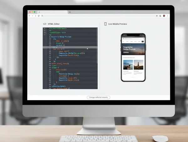
When you are deep in the middle of a project, you don't always want to open a heavy Integrated Development Environment (IDE) just to check a small layout fix. Lightweight, browser-based tools are incredibly valuable here. Using an integrated platform allows you to see the code and the result at the same time.
Our online HTML tool is designed to be a "sandbox" for these exact moments. It combines editing, viewing, and formatting into one window. This helps you focus on the specific mobile issue without getting distracted by complex file structures or local server setups.
Real-Time Preview: See Changes Instantly Across Devices
The most powerful feature of a modern debugger is the real-time preview. In the past, you had to save a file, refresh the browser, and navigate back to the right section to see a change. Use an html viewer online to see the preview update as you type.
This "what you see is what you get" (WYSIWYG) approach is perfect for mobile debugging. If you are trying to center a button on a small screen, adjust the padding or margins in the code editor and watch the button move in real-time. This saves hours of trial and error and allows for the fast "micro-adjustments" that define a high-quality user interface.
Import and Debug: Analyze Live Mobile Websites
Have you ever visited a competitor's site and wondered how they handled a specific mobile menu? Or perhaps you need to fix a bug on a live site that you don't have the local files for. The "URL Import" feature is a game-changer for these scenarios.
Enter any URL to import HTML instantly. Test fixes in our editor first—then deploy polished code to your live site. This is an excellent way to do competitive research or perform a quick SEO audit on meta tags and header structures.
Step 3: Code Optimization for Mobile
Mobile users often have slower internet connections than desktop users. This means your code needs to be as "lean" as possible. However, lean code is often impossible for humans to read. You need a balance: clean code for development and small code for performance.
Beautify for Readability
A smart html beautifier transforms messy code into clean, indented files. Edit with clarity—then minify for speed. Reformatting compressed code into a readable structure allows you to spot nesting errors or unclosed tags that might be ruining your mobile layout.
Minify for Performance
Once you have finished debugging and the layout looks perfect, use a "minify" function to strip out unnecessary spaces and comments. This ensures your mobile site loads quickly. High performance is a key ranking factor for mobile SEO, and minification is one of the simplest ways to achieve it.
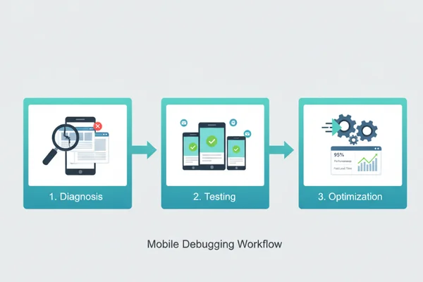
Step-by-Step Mobile Debugging Workflow
Fixing a broken layout requires a logical approach. Jumping straight into the CSS often leads to more bugs. Instead, follow a structured workflow to ensure your mobile fixes are stable and effective.
Diagnosis: Identify Mobile-Specific Rendering Issues
The first step is always diagnosis. You need to find out exactly what is breaking. Common symptoms include horizontal scrolling where the page "wiggles," text that overflows its container, or buttons that are too close together for easy tapping.
Paste your code into the online html viewer and look for "hard-coded" values. Search for any instance of width that uses pixels. These are the most likely culprits. Also, check your images; if an image doesn't have max-width: 100%;, it will often push the boundaries of a mobile screen and break the layout.
Testing: Validate Fixes Across Screen Sizes
Once you identify the problem, start applying fixes in the editor. Use the real-time preview to verify the changes. A great way to test mobile responsiveness is to change the container size in your code. Wrap your entire HTML in a <div> with a fixed width of 375px to simulate the mobile experience directly in the viewer.
Check how your navigation menu behaves. Ensure it collapses into a "hamburger" menu if intended. If columns don't stack vertically, you may need to add a CSS Media Query to change the styling specifically for smaller screens.
Optimization: Final Mobile-First Adjustments
After the layout is fixed, it is time for the finishing touches. Mobile-first design isn't just about fitting everything on the screen; it is about performance and usability.
-
Check Tappable Targets: Ensure all buttons and links are at least 44x44 pixels.
-
Verify Font Size: Ensure your base font size is at least 16px so users don't have to "pinch to zoom."
-
Clean the Code: Use the html formatter to make sure your final code is clean and professional.
Finally, download your updated .html file directly from the tool. You now have a debugged, optimized version of your code ready for your website.
Master Mobile Responsiveness with HTML Viewer
Struggling with mobile layouts? Our tool turns chaos into clarity. Understanding the core principles of the viewport meta tag, flexible layouts, and modern CSS allows you to build websites that look stunning on any device. Integrated platforms make this process accessible by letting you edit, preview, and optimize your code in one place.
Remember, a mobile-friendly site is better for your users and your Google rankings. Don't let a broken layout hold your project back. Whether you are a professional developer or a student just starting out, you can try our free tool today to streamline your workflow and master the art of mobile-first design.
Frequently Asked Questions About Mobile HTML Debugging
How do I view HTML code for mobile responsiveness?
The easiest way is to use an online tool where you can paste your code and see a side-by-side preview. By using a free html editor, you can manually adjust the width of your code's containers to simulate various mobile screen sizes and see how the elements react.
Why does my HTML look different on mobile vs desktop?
This usually happens because of "fixed" dimensions or the lack of a viewport meta tag. Mobile browsers interpret code differently than desktop browsers to account for touch screens and smaller displays. If you don't provide specific mobile instructions via CSS media queries, the browser makes its own "best guess," which often leads to layout errors.
What is the best way to test mobile layouts?
The best way is to use a combination of browser developer tools and an online html viewer. Online viewers are excellent for quick edits and testing specific code snippets without the overhead of a full development environment. Always test on actual mobile devices if possible after your initial debugging is complete.
Can HTML Viewer help fix mobile menu issues?
Yes. Mobile menus often fail because of z-index problems or display: none settings that don't trigger correctly. By pasting your code into the viewer, you can instantly toggle CSS classes to see why a menu isn't appearing or why it is being hidden behind other content.
How do I check if my HTML is mobile-friendly?
Check for three main things: a viewport meta tag in the <head>, the absence of horizontal scrolling on small widths, and legible font sizes. You can start your test by importing your URL into our tool and checking if the structure looks organized and responsive in the preview window.