Fix HTML Layout Bugs Fast: A 7-Minute Case Study
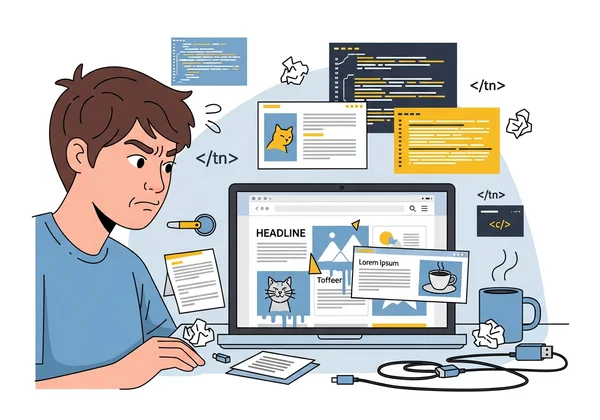
It’s 3 PM on a Friday, and you’ve just received an urgent message. A critical layout bug has appeared on the live website, but it only shows up on certain mobile devices. Elements are overlapping, text is wrapping incorrectly, and the user experience is broken. The pressure is on to find and fix it fast.
Does this sound familiar? Hunting for elusive HTML and CSS bugs can be a frustrating and time-consuming process. Traditional methods often involve a slow cycle of making a change, redeploying the code, and waiting to see if it worked. This process can turn a small bug into hours of lost productivity.
But what if you could diagnose and fix that bug in just seven minutes? Let me walk you through the exact workflow that solved our problem in record time. By the end, you'll have a step-by-step process you can apply immediately to your own layout issues with just a few clicks of our free HTML viewer.
The Production Bug: Symptoms and Initial Diagnosis
Before finding a solution, we first had to understand the problem. The bug was subtle but damaging. On most desktop browsers, the page looked perfect. However, on specific mobile viewports, a key promotional banner was colliding with the main content, making both unreadable.
Identifying Layout Rendering Issues Across Devices
The first step was to catalog the symptoms. We noticed that on smaller screens, a CSS flexbox container wasn't behaving as expected. Some elements were not wrapping correctly, causing them to overlap with a neighboring grid. This is a classic example of a layout rendering issue, where the code works in one environment but breaks in another.
These inconsistencies are common. Different browsers and devices can interpret CSS rules slightly differently, leading to unexpected visual glitches. We confirmed the bug was present in Chrome on Android but not on Safari for iOS, which pointed toward a specific rendering engine conflict or a poorly defined media query.
Why Traditional Debugging Methods Were Ineffective
Our initial instinct was to use the browser's built-in developer tools. While powerful, they presented a major hurdle in this case. The issue only appeared on the live production server. Making temporary changes in the browser's inspector was useful for a quick check, but those changes were lost on refresh.
The alternative was a slow, frustrating loop. We had to tweak the CSS in our local code editor, push the changes to a staging server, and wait for it to build and deploy. Each iteration took several minutes, turning a simple investigation into a lengthy ordeal. We needed a way to edit the live code in a sandbox environment with an instant feedback loop.
HtmlViewer's Debugging Workflow: Step-by-Step
Tired of the slow deployment cycle, we turned to a faster approach. We used the online tool at HtmlViewer.cc to create an isolated "operating table" for the broken webpage. This allowed us to perform targeted surgery on the code and see the results instantly. Here is the step-by-step process that took us from diagnosis to solution in minutes.
Step 1: URL Import for Live Production Code
Instead of manually copying and pasting code from the browser's "View Source" page, which can be messy and incomplete, we used a more direct method. We simply pasted the URL of the broken page into HtmlViewer.cc's URL import feature.
In seconds, the tool fetched the exact HTML and linked CSS from our live server. This gave us a perfect, real-time copy of the production code in a clean, editable format. It was far superior to copying from dev tools because it grabbed the raw document before the browser applied its own interpretations, ensuring we were working with the true source. This is the fastest way to view HTML source from any live website.
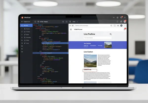
Step 2: Real-Time Preview and Side-by-Side Comparison
With the code loaded, the magic began. HtmlViewer.cc instantly displayed the code in an editor on the left and a live visual preview on the right. As we resized the preview pane, we could immediately replicate the mobile layout bug. The overlapping elements appeared right there on our screen.
This side-by-side view was a game-changer. It eliminated the need to switch between an editor and a browser window. The instant feedback cycle meant we could test theories about the bug's cause in real-time. We could see the direct impact of every single code change as we typed.
Step 3: Code Beautification for Better Visibility
The imported source code was minified, making it a dense, unreadable block of text. This is great for performance but terrible for debugging. With a single click on the "Beautify" button, the tool transformed the compressed code into a perfectly formatted and indented structure.
This clean structure was crucial. Suddenly, we could clearly see the nesting of div elements, the order of CSS classes, and the overall document hierarchy. The improved visibility helped us spot a potential conflict in how different CSS rules were being applied to the same container. An HTML beautifier makes complex code easy to navigate and understand.
Step 4: Targeted CSS Testing in the Editor
Now that we had a clean, editable copy of the code and an instant preview, we could start the real detective work. We suspected a CSS issue, so we started commenting out different style blocks directly in the editor. Each time we removed a section, the preview on the right updated instantly.
This rapid iteration allowed us to quickly isolate the problematic CSS rule. We narrowed it down to a media query that was applying a rigid width to a flex container on smaller screens. We tested a new CSS property directly in the editor, watched the layout snap into place in the preview, and knew we had found our fix.
The Root Cause and Solution
The final step was to understand why the bug occurred and implement a permanent fix. The rapid testing workflow in HtmlViewer.cc gave us the clarity we needed to identify the core problem with confidence.
Discovering the CSS Specificity Conflict
The root cause was a classic CSS specificity conflict. A general stylesheet set a flexible width for all containers, but a more specific media query for screens under 480px was overriding it with a fixed pixel value. This fixed value was larger than some mobile screens, causing the container to overflow and collide with other elements.
The beautified code made it easy to trace the conflicting styles. We saw that a rule intended for tablets was incorrectly cascading down to smaller mobile devices. This is a common bug in complex, responsive designs, and it can be nearly impossible to spot in minified code.
Implementing the Fix and Verification
The solution was simple. We adjusted the media query to be more specific and replaced the fixed width with a flexible max-width: 100%. This ensured the container would never exceed the width of the viewport.
After testing the change in the online HTML editor and confirming it worked across different preview sizes, we copied the corrected CSS snippet. We pasted it into our local codebase, pushed the single-line change to production, and the bug was gone. The entire process, from discovery to deployment, took just over seven minutes.
Key Lessons and Pro Tips for HTML Debugging
This experience taught us valuable lessons about modern web development workflows. The right tool doesn't just solve a problem; it changes how you approach problem-solving itself.
When to Use HtmlViewer vs. Browser Dev Tools
Browser developer tools are essential for inspecting the live, rendered state of a page and for performance profiling. However, for isolating issues, rapid prototyping, and editing code in a clean sandbox, an online editor like HtmlViewer.cc is often faster.
Use dev tools to find the "what" (what element is broken?). Use an online HTML viewer to discover the "why" (why is this code causing a break?) by freely editing and testing in an isolated environment without the fear of breaking anything on your live site.
Streamlining Your Debugging Process
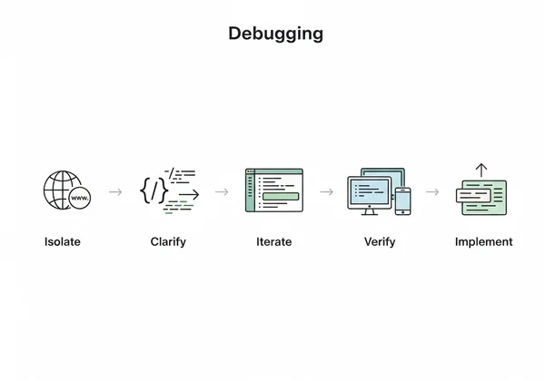
To maximize your efficiency, adopt this workflow:
- Isolate: Use the URL import feature to grab the problematic code.
- Clarify: Use the "Beautify" function to make the code readable.
- Iterate: Make small, targeted changes in the editor and watch the real-time preview.
- Verify: Test your solution across different viewport sizes within the previewer.
- Implement: Copy your verified fix back into your project's source code.
This methodical approach saves time and reduces the cognitive load of switching between different tools and environments.
Preventing Similar Bugs in the Future
The best way to fix a bug is to prevent it from happening in the first place. This incident reminded us of the importance of disciplined coding practices. Always use relative units (like % or vw) for widths in responsive designs instead of fixed pixels where possible. Additionally, regularly reviewing your CSS for specificity conflicts can save you hours of debugging down the road.
Your 7-Minute HTML Debugging Toolkit
This workflow reduces what used to be hours of trial and error to a focused, 7-minute process. The 7-minute workflow—Import, Beautify, Edit, and Preview—is a powerful strategy for tackling any HTML or CSS layout issue. By combining the power of live code fetching with an instant visual feedback loop, you can find the root cause of bugs with surgical precision.
This approach isn't just for fixing errors. You can use it to prototype new components, learn from the source code of other websites, or optimize your code for better performance. The core principles of isolating and iterating in a fast, visual environment apply to countless web development tasks.
Are you ready to stop wasting time on frustrating layout bugs? The next time you face a stubborn rendering issue, don't get stuck in a slow deployment cycle. Give this workflow a try and see how quickly you can solve the problem.
Visit our website to try the free tool and transform your debugging process today.
Frequently Asked Questions About HTML Layout Debugging
How do I view the HTML code of a website to debug layout issues?
The easiest way is to use an online tool. Simply go to HtmlViewer.cc, paste the website's URL into the importer, and it will fetch the complete HTML for you. You can then use the "Beautify" feature to format the code for easy reading and start your debugging process in the side-by-side editor and preview.
Why does my HTML look different in different browsers?
This is a common issue known as a cross-browser compatibility problem. Different web browsers (like Chrome, Firefox, and Safari) use different rendering engines, which can sometimes interpret HTML and CSS code in slightly different ways. Using a tool with a live preview can help you test and adjust your code to ensure it looks consistent everywhere.
How can I quickly test CSS changes without redeploying?
The fastest way is to use an online HTML editor with a real-time preview. You can paste your HTML and CSS into the editor and see your changes instantly without needing to upload files to a server. This allows for rapid iteration, where you can test dozens of CSS changes in minutes to find the perfect solution.
What's the difference between using HtmlViewer and browser dev tools?
Browser dev tools are great for inspecting the "computed" state of an element on a live page. However, they are not a true code editor. HtmlViewer.cc acts as a full "sandbox" or playground. It allows you to import, edit, beautify, and save entire HTML files while seeing a live preview, making it ideal for fixing complex layout bugs, prototyping, and learning from existing code. The two tools work best when used together.