CSS Box Model Explained: Visual Guide & Online Editor
Ever struggled with web page layouts where elements just won't sit right? The culprit is often a misunderstanding of the CSS Box Model, the most fundamental concept in web design. It governs how every HTML element is rendered on the screen, defining the space it occupies. How to preview an html page with perfect spacing depends entirely on mastering this principle. This guide will visually break down the box model's components—content, padding, border, and margin—transforming confusion into clarity. Better yet, you’ll learn how to use an online HTML editor to see these concepts in action, instantly.

Understanding the Fundamental CSS Box Model Components
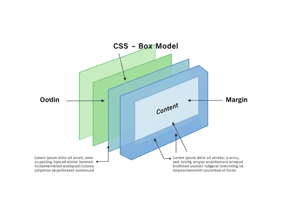
Every element on your webpage is a rectangular box. This box is composed of four distinct layers, stacked from the inside out. Understanding each layer is the first step toward predictable and professional web layouts. Think of it like a framed picture: you have the picture itself, the matting around it, the frame, and the space between it and other pictures on the wall.
The Content Area: Your Element's Core
At the very center of the box is the element's core: the content area. This is where your text, images, videos, or other media appear. The dimensions of this area are defined by the width and height properties in your CSS. For example, if you set width: 300px; for a <div>, you are defining the width of this content box. All other layers are added around this central part.
Padding: Inner Space and Visual Breathing Room
The next layer out is the padding. Padding is the transparent space between the content area and the element's border. Its primary purpose is to provide visual breathing room, preventing your content from bumping right up against its container's edge. You can control the padding on all four sides using properties like padding-top, padding-right, padding-bottom, padding-left, or the shorthand padding property. Increasing padding makes the element visually larger from the inside.
Border: The Outline Between Padding and Margin
The border is the visible frame that surrounds the content and padding. It acts as the boundary of your element. You have precise control over its appearance, including its thickness (border-width), style (border-style—e.g., solid, dotted, dashed), and color (border-color). The border is a key component in element sizing, as its thickness contributes to the overall dimensions of the box.
Margin: Outer Space and Element Separation
The final, outermost layer is the margin. This is the transparent space outside the border. The margin's job is to create distance between an element and its neighbors, ensuring proper element separation. If you want to push two <div> elements away from each other, you would increase their margins. Unlike padding, margins can sometimes "collapse" when two vertical margins meet, which is an important behavior to understand for complex layouts. You can experiment with this effect using an online html viewer.
Content-Box vs. Border-Box: Demystifying CSS Sizing
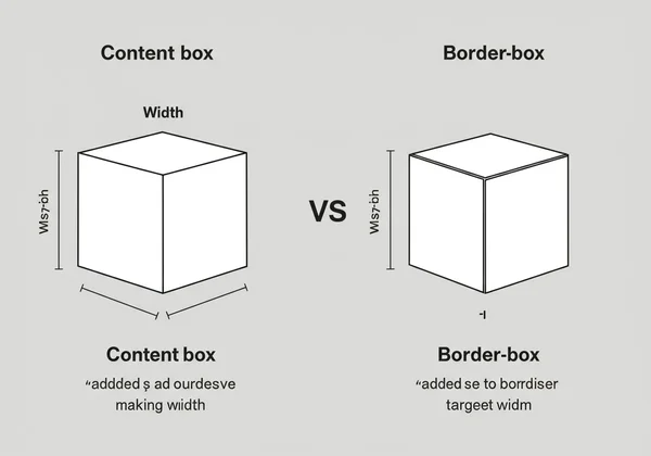
One of the most common sources of frustration for developers learning CSS is how an element's total size is calculated. This is controlled by the box-sizing property, which has two main values that fundamentally change the box model's behavior.
The Standard Box Model: content-box Explained
By default, all elements use box-sizing: content-box;. In this standard box model, when you set an element's width and height, these dimensions apply only to the content area. The padding and border are then added on top of that width and height.
For example, if you have:
.my-box {
  width: 200px;
  padding: 20px;
  border: 10px solid black;
}
The total rendered width of .my-box will be 260px (200px content + 20px left padding + 20px right padding + 10px left border + 10px right border). This additive behavior can make layout calculations complex and unintuitive.
The Intuitive Box Model: border-box Explained
A much more predictable approach is box-sizing: border-box;. In this intuitive box model, the width and height you define represent the total dimensions of the element, including the padding and border. The browser automatically subtracts the padding and border thickness from the content area.
Using the same example with border-box:
.my-box {
  box-sizing: border-box;
  width: 200px;
  padding: 20px;
  border: 10px solid black;
}
The total rendered width of .my-box is exactly 200px, as specified. The content area inside will automatically shrink to 140px to accommodate the padding and border. This makes creating grid systems and responsive designs significantly easier.
When to Use Each: Choosing the Right box-sizing Property
For modern web development, it's almost always recommended to set box-sizing: border-box; globally. This creates a more consistent and manageable layout system. Many developers add the following CSS reset to the top of their stylesheet to apply this behavior to every element:
*,
*::before,
*::after {
  box-sizing: border-box;
}
This simple rule streamlines the entire development process by ensuring that the dimensions you set for an element are the dimensions you see on the screen. You can test this code now to see the dramatic difference it makes.
Applying the Box Model: Margin vs. Padding in Practice
Knowing the difference between margin and padding is crucial for precise control over your layouts. While both create space, they do so with different intentions and effects.
Mastering Space: When to Use Margin, When to Use Padding
Here's a simple rule of thumb for mastering space:
- Use padding when you want to increase the space inside an element's border. A great example is a button; you add padding to create space between the button text and its border, making it look more balanced and clickable. The background color of the element will extend into the padded area.
- Use margin when you want to increase the space between an element and other elements on the page. If you want to push a heading away from the paragraph below it, you would add
margin-bottomto the heading ormargin-topto the paragraph.
Common Box Model Issues & Debugging Tips
One common issue is "margin collapsing," where the top and bottom margins of adjacent block-level elements combine into a single margin. For instance, if one element has margin-bottom: 20px and the next has margin-top: 30px, the space between them will be 30px, not 50px. While this is intentional behavior, it can be confusing. Another problem is elements overflowing their containers when using the default content-box model. For debugging CSS issues like these, an online html editor provides a sandboxed environment where you can isolate the problematic code and test solutions quickly.
Visualizing Your CSS Layouts with Html Viewer
Theory is important, but the best way to truly understand the CSS Box Model is by seeing it. This is where a real-time visualization tool becomes invaluable. With Html Viewer, you can edit your code and see the impact of every change instantly, without any complex setup.
Step-by-Step: Using Html Viewer to Experiment with the Box Model
Let's experiment with the box model. It's incredibly simple:
- Navigate to the our instant preview tool on our site.
- Paste the following HTML and CSS into the editor pane:
<style> .box { box-sizing: border-box; width: 250px; height: 150px; padding: 20px; border: 5px solid #007BFF; margin: 30px; background-color: #E9ECEF; } </style> <div class="box"> This is my content. </div> - In the editor, change the
paddingvalue from20pxto40px. Watch the content area shrink in the live preview pane, while the overall box size remains 250px wide. - Now, change the
marginfrom30pxto50px. Notice how the box pushes itself further away from the edges of the preview area.
Instant Feedback: The Power of Real-time Preview for Learning CSS
This immediate feedback loop is what makes tools like our online editor so powerful for learning. Instead of saving a file, switching to a browser, and refreshing the page, you see the result of your code as you type. This real-time preview helps solidify concepts like the box model by creating a direct, visual connection between your CSS properties and the rendered output on the screen. It turns abstract rules into tangible results, accelerating your journey from beginner to confident developer.
Master the CSS Box Model: Your Path to Perfect Layouts
The CSS Box Model is not just a feature of CSS; it's the very foundation of web layout. By understanding how content, padding, border, and margin work together, and by leveraging the power of box-sizing: border-box;, you gain complete control over the spacing and positioning of your elements. The key to mastery is practice, and there is no better way to practice than with a tool that provides instant visual feedback.
Ready to stop fighting with your layouts and start building with confidence? Visit Html Viewer to start practicing today and turn CSS theory into design reality.
Frequently Asked Questions About the CSS Box Model & Online Tools
What is the CSS Box Model and why is it important? The CSS Box Model is a web standard that treats every HTML element as a rectangular box. This box consists of four parts: the content, padding, border, and margin. It's critically important because it defines how elements are sized, spaced, and laid out on a webpage, forming the foundation of all CSS-based design.
How does box-sizing: border-box; simplify CSS layouts?
The box-sizing: border-box; property simplifies layouts by making an element's dimensions more predictable. When you set an element's width and height with this property, those values include the padding and border. This prevents elements from unexpectedly growing larger when you add spacing or borders, making grid systems and responsive designs much easier to manage.
Can I see my CSS Box Model changes in real-time? Yes, you absolutely can! Using a free html viewer like ours allows you to edit your CSS properties—such as padding, margin, or border—and instantly see the visual changes in a live preview pane. This immediate feedback is one of the most effective ways to learn and debug CSS.
How do online HTML viewers help with CSS learning? Online HTML viewers accelerate CSS learning by providing a zero-setup, interactive environment. Beginners can focus on writing code without worrying about local development environments. The instant, side-by-side preview creates a powerful visual link between code and output, helping to quickly solidify complex concepts like the box model, Flexbox, and Grid.